Phreesia Media Guide
Everything agency creatives need to know about creating campaigns for the Phreesia platform

Phreesia is a digital intake platform that replaces the piles of paperwork patients have traditionally been asked to complete when visiting their healthcare provider.
Using Phreesia’s secure, HIPAA-compliant platform, patients can check in for appointments with their mobile device or use a PhreesiaPad at their provider’s office.
Once check in is completed, patients are invited to view tailored health content from a third party. If they opt in, they’ll see content that includes public service announcements, unbranded educational content or branded information about a relevant pharmaceutical product.
Why Phreesia and point-of-care marketing?
The Point of Care Marketing Association defines “point of care” (POC) as “The moment a patient interacts with and receives care from a healthcare provider (HCP) in a healthcare setting.”
As a leader in the POC space, Phreesia plays a key role in your client’s marketing mix. After receiving the patient’s consent, our HIPAA-compliant, proprietary software captures health information in real time during check in. This gives brand managers the opportunity to serve up tailored content to clinically qualified patients just before they see their provider.
By delivering the right message to the right person at the right time, POC messaging through the Phreesia platform sparks meaningful conversations between patients and providers that can improve long-term health outcomes and change patient behavior.
A recent study of adults exposed to a branded message just before seeing their provider revealed the effectiveness of talking to patients at the POC:
More than 11M
switched brands
Over 18M
asked their provider to prescribe a specific drug
Over 17M
requested a product sample
Phreesia patient touchpoints
PatientConnect standard campaign
Specifications
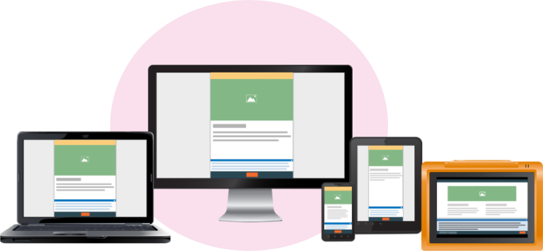
- Responsive; Mobile/Desktop and PhreesiaPad (used at the practice)
- PhreesiaPad dimensions: 1280px by 732px
- Mobile (target width): 390px
- 3 screens of content + Post-Visit Reminder (PVR) (see below)

Screen #1: Brand Opener content
Purpose: Get patients interested in a brand so they sign up for the offer; delivered at the point of care, just before a patient sees their doctor.
Content Best Practices:
- Quickly identify your brand and/or the condition/disease state
- Focus on information that’s relevant to the patient just before they speak with their HCP
Screen #2: Opt-In content
Purpose: Gather patient information (e.g., name, email, phone) and provide opportunity to receive follow-up resource and/or enrollment in customer relationship management (CRM) program.
Content Best Practices:
- Offer a follow-up resource that will incentivize patient to take action (patient brochure, Doctor Discussion Guide, fact sheet, insurance/savings/co-pay information or details about a patient support program)
- Keep language to a minimum; focus on the call to action (CTA)
- Be clear about the follow-up resource the patient is signing up for
- Legal requirement: In the checkbox language on the opt-in screen, the follow-up resource must be referred to exactly as it is in the content (e.g., “Doctor Discussion Guide,” “Brand X Patient Brochure,” “Link to more information,” etc.)
Screen #3: Confirmation/Thank-you Content
Purpose: Confirm submission of personal information; set expectations/timing for delivery of follow-up asset
Content Best Practices:
- Thank the patient for signing up, and confirm that their information has been successfully submitted
- Let patient know that the follow-up resources will arrive shortly and/or they will receive ongoing communication from the manufacturer
- Final opportunity to provide additional content that positively reinforces your patient’s decision to sign up
Post-Visit Reminder (PVR)
Purpose: Final patient touchpoint that’s sent 3-5 hours after the visit; used only with PatientConnect Standard campaigns.
Specifications
- Unbranded banner; 300 x 250 pixels @ 72 dpi
- JPEG or PNG (cannot serve rich media)
- Include a text link at the top of the banner for cases when email client is not set up to display images
- Use a clear, specific call to action
Post-Script Engagement (PSE) campaign
Purpose: Increase patient compliance by encouraging script fill. Patients see this branded messaging just moments after their provider has entered a prescription into a medical record.
Specifications
- Responsive; Mobile-only
- Typically uses the branding and messaging of the existing Phreesia Platform campaign
- 1 or 2 screens of content (Brand Opener + Opt-in)
- Often uses a pop-up modal for the Confirmation/Thank-you content
Content best practices for the Point of Care
Phreesia’s proprietary message testing has shown that point-of-care copy works best when it’s:
- Succinct – Briefer messaging tends to increase recall. Focus on the most important information the patient needs to know about your brand just before they see their provider. Once the patient opts in to receive more information, there will be many opportunities to tell the full brand story.
- Positive – Patients are significantly more likely to take action when they’ve been exposed to positive messaging* (also called “gain framing”).
- Actionable – Be crystal clear about what you want the user to do and what they’ll receive if they opt in.
Creative and technical guidelines for art directors and designers
Getting started
Step 1: Begin by downloading the required XD Phreesia Templates
Step 2: Use the templates to leverage existing creative assets to design your Phreesia campaign.
Step 3: Submit the final packaged files to Phreesia with all linked assets and fonts.
Step 4: Phreesia will program your campaign in HTML from the supplied packaged files.
Phreesia templates
The Phreesia templates are comprehensive and intuitive, designed to guide you through the process of creating campaigns for the Phreesia platform
- Available in Adobe XD and Figma format
- Formatted for pharmaceutical, over-the-counter (OTC), unbranded, educational and public service campaigns
There are templates for each screen in the Phreesia Patient Experience:
- Brand Opener
- Opt-In
- Confirmation/Thank-you
- Post-Visit Reminder (PVR); this template is used only for PatientConnect standard campaigns
Design requirement and guardrails
Here are the most important things to keep in mind as you begin designing within the Phreesia templates.
Mobile First Responsive Layout
- Our templates are designed to accommodate the smallest screen first
- As the content is built out, it will retain a similar aspect ratio, scaled up for larger devices
Fonts
- Use open-source Google fonts only
- Google Fonts is an excellent resource
- A minimum font size of 10 points is recommended to ensure legibility
Phreesia Global Navigation
- Required on every page
- Appearance (i.e., color/size/design) cannot be altered
PI & Med Guide Viewer
- Refer to the template to add each PDF to the appropriate modals
- The Phreesia platform can accommodate your brand’s required links within the sponsored content (Prescribing Information and Medication Guide) using its PI Viewer
- Phreesia will point the PI Viewer to retrieve the PDF from your brand’s URL
- The PI Viewer displays your PDF in a pop-up modal on top of your campaign
- If the URL on the website is not compatible with the PI viewers, Phreesia can host a PDF of the required documents locally
Displaying ISI
- Display the required amount of ISI above the fold (if applicable)
Intra-campaign buttons
- Internal Links are allowed on both Pad and Mobile to supplement Phreesia’s required navigation
- For legal reasons, whenever a “Submit” button is added, a “No Thanks” button must be added as well
- The Phreesia Platform can accommodate jump links on content pages
Frequently asked questions
Phreesia & POC FAQs
Do patients trust the information they see at their doctor’s office?
Yes! According to recent surveys conducted on Phreesia’s PatientInsights platform, patients trust and engage most with content they see at the POC, compared with other channels.
Patients regard
their doctor’s office—whether physical or virtual—as a trusted source for medical information
Not only do patients consider POC content to be more reliable than messaging on TV and social media, but they also feel more motivated to start conversations with their doctor about information they see just prior to their appointment.
Why is advertising at the POC effective?
In addition to inspiring more trust and sparking greater patient activation, health content delivered at the POC also is more cost effective. A recent case study from Veeva Crossix found that the POC was the most cost-efficient driver of conversions. Representing 2% of the campaign’s overall media investment, the POC was attributed to driving 17% of new-to-brand prescriptions (NBRx).
Conversely, the channels with greater campaign spend didn’t have as strong results. Media investments in TV (68%) and paid search (6%) drove lower percentages of NBRx conversions at 45% and 2%, respectively.
Is the Phreesia platform a secure environment?
Yes. Security and patient privacy are top priorities at Phreesia. Our corporate culture is focused on safeguarding patient data, and we’re honored to have earned some of the industry’s most well-known security certifications.


Content best practices FAQs
Is there a character limit for the Phreesia platform screens?
While there is technically no limit, we highly recommend that you keep your copy brief. Focus on conveying the most important information your target patient needs to know just before they see their HCP.
Can we mention a brand name in the PVR banner?
No. This is to avoid triggering a need to include ISI/fair balance. Phreesia’s proprietary message testing has shown that simple, more clinical-looking banners tend to perform better within a provider-owned email.
What is the allowed character count in the PVR banner?
There isn’t a character limit. However, the PVR banner is no different than any other type of banner. That is, you want to keep the copy as short and to the point as possible with a clear CTA. The minimum font size allowed in the PVR banner is included in the Phreesia templates.
What is “Data Pass,” and why would my client use it?
If your client has a CRM program, they can choose to use the Phreesia Opt-In Screen to invite patients to receive ongoing marketing communications.
That’s why the CTA for campaigns that use Data Pass must clearly state that the patient is agreeing to be added to a CRM mailing list managed by the brand by signing the Consent to Share.
Because the laws around patient privacy are ever-changing, the specific language to be used for data pass is included in the Phreesia Templates, which are updated regularly.
General requirements FAQs
Can we change the color or design of the buttons in the Phreesia navigation to match our brand colors?
No. The Phreesia user interface and navigation are standard and remain consistent from the patient check-in experience through the end of the engagement.
Are we allowed to add other links into the layout?
Internal links are allowed on both Pad and Mobile to supplement Phreesia’s required navigation.
We need to have important safety information (ISI) on every page. Where can we put it, and how will patients scroll through it?
If the ISI for your pharmaceutical brand is required on each screen of your campaign, it needs to remain in a fixed position.
How does Phreesia add live PI/Med Guide links to my layout?
We host brand’s required links using our PI Viewer, which converts the pages of your website’s PDF into images and displays them at 72 DPI in a pop-up modal. Refer to the template for instructions on adding the PI and Med Guide PDFs to your layout.
What if the URL on my brand’s website isn’t compatible with your PI Viewer?
If that’s the case, Phreesia can host a PDF of the required documents locally.
What if the URLs for my brand’s PI/Med Guide change while our Phreesia campaign is still live?
If the URLs are hosted by Phreesia via our PI Viewer, the brand team or agency of record will need to provide a new PDF. We can make this update within 24-48 hours.
What happens if our brand gets a label update and the content in our PI/Med Guide changes?
If the URLs for the PI/Med Guide are hosted by the brand and the links do not change, the label updates will automatically be reflected in your campaign.
Design FAQs
Can I customize my campaign’s ISI drawer?
Yes. You can customize colors, fonts, height, and width, as long as the content can be accommodated by the size constraints of our screens.
Is the PhreesiaPad scrollable?
Yes. But keep in mind that our proprietary message testing has shown that patients respond best to copy that is succinct, positive and actionable.
Can I change the height of the horizontal ISI drawer? Can I change the width of the vertical scrolling ISI?
Yes. You may adjust the default height or width of the horizontal and vertical ISI containers. If you choose to make adjustments, be mindful of any brand requirements for what must be visible above the fold and how your design will affect your available screen real estate.
Can I change the location of the bottom Navigation Bar?
No. The bottom navigation is a part of the platform’s Global UI and must remain fixed at the bottom of every screen. You may edit the text within but not the colors, fonts, sizes, positions, etc.
What colors are best to use in the unbranded PVR?
Our message testing has shown that clinical-looking banners with limited colors have higher response rates.
Can I add internal links to my layout?
Yes. Internal links are allowed on both Pad and Mobile to supplement Phreesia’s required navigation as long as they don’t contradict or undermine Phreesia’s workflow.
- You are encouraged to use them strategically to encourage navigation through the campaign screens
- May be styled to match your brand and placed anywhere in your available content area
- Can function as jump links to content that is below the fold
What is the minimum font size for the PVR banner?
A minimum font size of 10 points is recommended to ensure legibility.
Is the Follow-Up Email customizable?
We cannot alter the template layout, but you may customize the copy, the URL link, and button/border colors to align with your branding.