BLOG POST
Brands are increasingly paying attention to whether their intended audiences can understand and act on the content they deliver.
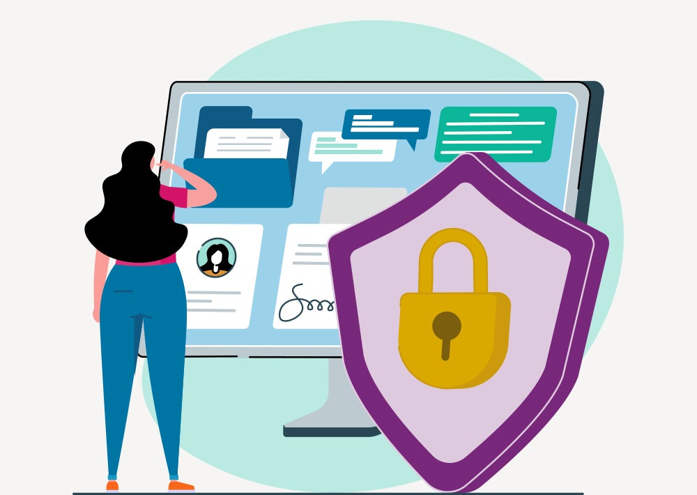
The factors that inform campaign copy and design choices are changing. Increasingly, brands are paying more attention to a core question: Can my intended audience easily understand and act on this information? The shift reflects recognition of the importance of health literacy in achieving health equity.
The U.S. Department of Health and Human Services defines health literacy as the degree to which individuals can find, understand and use information and content to inform health-related decisions and actions for themselves and others. That makes health literacy a social determinant of health; the ability or inability to find, understand and use health information can impact patients’ health outcomes.
A key concept to remember is that “health literacy is a state, not a trait,” explain Holly Ricci and Lindsey Lilly, Senior Copywriters at Phreesia who recently completed the Health Literacy Certificate Program at the Institute for Healthcare Advancement (IHA). This means that health literacy levels can fluctuate depending on patients’ circumstances, independent of their education or reading level. “No matter what you put in front of a patient who just got a cancer diagnosis, it will blur in front of their eyes,” Ricci says.
It’s particularly important to consider the situational nature of health literacy when communicating at the point of care, where patients may be nervous, unwell or in a hurry. “It’s helpful to be as mindful as possible about their mindset, their stress level and their familiarity with the disease,” Lilly said.
Focusing on the most important information, arranging it logically and ensuring it is easy to read will result in content that is digestible, accessible and actionable for all patient audiences. Here’s how.
Use simple copy to increase understanding
Using plain language is critical for maximizing health literacy, especially since health conditions and treatments are complicated subjects that are often discussed using technical language and jargon that can be a barrier to understanding. Copy should be simple, and calls to action should be clear and succinct.
“It’s about speaking conversationally. You can start a sentence with a conjunction or a preposition, and you can end a sentence with a preposition. This is not academic writing—it’s talking to people. Use simple verbs and use the present tense, and speak to people directly,” Ricci says.
And what you don’t say can be as important as what you do say. Everyone has a finite capacity to retain messages, and that limit can be low in stressful healthcare settings. Lilly recommends being very strategic with messaging to focus on a key takeaway that may interest a patient rather than bombarding them with more information than they can process.
Design content to help patients retain key messages
Design elements can also help make messaging easier to understand, either by enhancing the copy or mitigating the shortcomings of text that’s been set in stone after medical, legal and regulatory affairs review. Patients are unlikely to read every word, but effective design choices overcome that problem by setting the text out in a way that allows readers to absorb the core message even if they only scan the material.
“You want to be sure that you’re using a clear, legible typeface. You don’t want anything that looks too tight, or too far apart, for that matter. Use a variety of upper and lowercase letters. You don’t want to have everything in all caps,” Lilly says.
Lilly and Ricci recommend breaking the copy up into smaller paragraphs, a practice known as chunking, and structuring the text so the material guides the eye to the key message. Bullet points are an effective way to clearly communicate critical points, with key information immediately visible. If patients have to scroll to read a message, many will never see it.
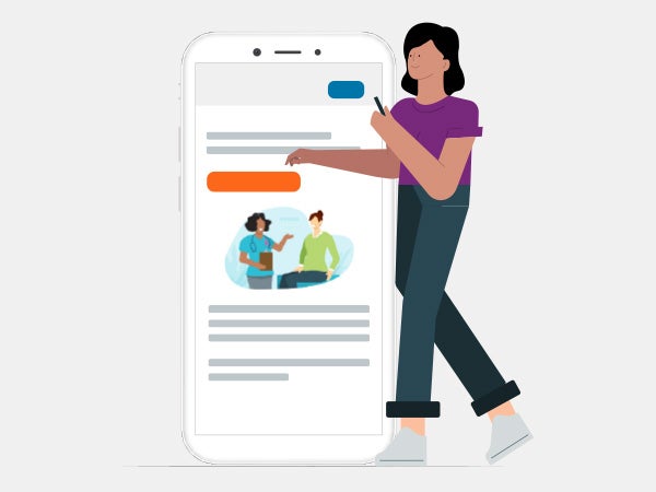
Other best practices include leaving as much white space as possible and including subheadings, which can help patients get the gist even if they only run their eyes over the material. Adding images and graphics breaks up the content, enhances the messaging and gives brands a chance to use their own iconography.
Tailor content to the intended audience
Health literacy is shaped by cultural perspectives and, as such, decisions about the copy and design must be informed by knowledge of the intended audience. Effective campaigns consider patients’ perspectives and tailor messages to them, resulting in content that the audience can understand and act on.
“It’s speaking to people the way that they want to be spoken to. Taking that diversity into account is a big part of health literacy,” Lilly says. “Speaking to people in a way that’s respectful and mindful of their culture is the best way to improve communication.”
The ability to tailor messages relies on a clear understanding of the intended audience, which for some campaigns may be broad and diverse. In these instances, using illustrations that are culturally generic, rather than photographs of actual people, can help more patients see themselves in an image and reduces the risk that the specificity of an image will prevent people from engaging with the content.
Learn how Phreesia can help you reach the right patients with tailored, digestible and actionable content.